At this stage above, I have used the visual as a starting point, and built it up. I've used only the brushes I previously created, and referred back to my previous digital work in the overlay technique to apply colour. This time, I touched up on the piece afterwards by adding another normal layer and adding any details requiered.
The final result, as I intended it to, incorporates the historical grounding to make the piece believable, and an understanding of the human form, including when it is merged with that of another being, while retaining an essence of Frank Frazetta's style. As previously mentioned, I also wanted to capture the action suggested to create a sense of movement.
Mark Paul-Sobral ILLUS 241
Tuesday, 24 April 2012
Monday, 23 April 2012
Visual
At first, I wanted to produce a series of visuals based on the thumbnails, but as time has become an issue, and noting from other illustrators who design an image based on one visual only, I will be a straight-shooter, and set off for one, tighter visual. This will allow me to just start off picking the cream of the crop from the thumbnails and tweak from an earlier stage.
As you can see, I wanted to get the feel of the paintings made at the period of the American Revolution, such as "Crossing the Delaware" or "Prayer at Valley Forge" (for reference, check page 57 on sketchbook). At the same time I wanted the image to convey the movement and actions to appeal to modern viewers and to simulate the style of Frazetta's work with the human form.
As you can see, I wanted to get the feel of the paintings made at the period of the American Revolution, such as "Crossing the Delaware" or "Prayer at Valley Forge" (for reference, check page 57 on sketchbook). At the same time I wanted the image to convey the movement and actions to appeal to modern viewers and to simulate the style of Frazetta's work with the human form.
Sunday, 22 April 2012
Ipad Drawings
In pertaining with the styles of Frank Frazetta, I wanted to give it a go attempting to draw some stock photographs (from lack of spare-time nude models) using the Ipad. I designed this exercise as a quick approach, much like the warm-up exercises executed in the life drawing room. Anyhow these are my results:
Making Brushes
These are my latest experiments in Photoshop. After attempting to find an original way of making textures, I felt I ought to apply the same tactic to my brushes, so my final piece could really feel personal to me and only to me. Thus I began to experiment with texturing brushes, and making patterns ready to turn into brushes, via the edit menu, and "edit Brush Preset" option. Then I could refine the brush to achieve the effect desired. I wanted to focus on brushes I could use to suggest texture on the piece, general brushes that could be used for the beginning stages, like the top two, for blending [bottom two] and general mark-making [vertical brush stroke] and general background texturing, from foliage to rocks. I think I may specialise some fur brushes so I can get a nice effect from the bear fur next.
Monday, 16 April 2012
Texturing Originality
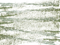
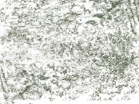
When it comes to adding life to a digital piece, many would argue how textures are among the best ways to do so- and a lot of digital artists use stock textures from the net in their work, and I would know, I have done it plenty of times. On the other hand, others prefer to add originality to their work, by capturing the essence of the environment around them in close up and extracting textures that way. That got me thinking: is there a way of taking that a step further? Then the answer came as not a step further, but a lot of steps back- Texture is everywhere, and not just in the closer spectrum of one's vision. Our ocular ability to discern masses and distance all derive in the texture created by the objects clustering together, from trees, to ripples in the water. This realisation meant that I could find textures to be made in any image I had, from landscapes to even portraits. All that I had to do was to seclude those details from the rest of the image. The answer to that came in the form of the Color Range Tool in Photoshop, under the Select menu. And here are the results of my experiment.


Saturday, 25 February 2012
Photomanipulation Exercise I
I picked out a photo I wanted for my Blog profile, and I started off by choosing a picture, a trip I took in the summer to Paris to meet some relatives. So once I decided where I wanted it to go, I isolated myself by using the pen tool to mark a path around myself and turning it to a selection (right click) and inversing the selection (on the 'select' menu) I put up a tonal gradient to have a different background and then went on Image > Mode > and Grayscale to make myself monochrome (now on step 2) The next step I just carried on with myselection and used different brushes and some colour temperature knowledge to paint some background colours! (step 3) and to the right of the third image, you'll see the various brush types I used for this exercise.
Subscribe to:
Comments (Atom)


